

Designing a Single page website takes more effort you spend to build a multi-pager. As you’ll see as we go down the list of critical elements involved. There’s plenty to think about. Satisfying all of them in your single pager takes plenty of planning and attention to detail.

One-page websites offer a fast and clear reading experience, intuitive scrolling, mobile friendliness, and a sleek design. In a world where users are constantly bombarded with too much content, people love the simplicity of one-page websites.
One-page websites are an excellent option for many different types of websites but they’re not a perfect, one-size-fits-all solution.
Before you create a single page website, make sure it’s the best option for your project or business. Here are some Critical Elements that can make or break a single page website design.
Web visitors are sharper and more judgmental than ever. And, they’re only growing more so, as the generations who have grown up with internet access take on a larger and larger percentage of the population. Strong, modern web design is vital to your brand’s reputation, your bottom line, and your future. Below are the seven design trends you might just start seeing more of around the web when our digital calendars flip to 2019.
One way to structure your website like a professional is to follow the cone principle. Important information should be at the top of your website, like what your website is all about. Then, gradually drill down to the more specific, supporting information. For example, say you’re creating a wedding website. The most important information—who is getting married and when and where is the ceremony taking place should be at the top of your website. The less important information, such as the registry, is at the bottom of the page.
Here are some of the best ways to differentiate each section of your single-page website:
The goal is to provide intuitiveness of navigation, which is not difficult to do. You just need to subdivide all the content into several logical blocks, place the navigation menu at the top of the page (for instance, in the header), and make sure that one is able to get somewhere (by automatic scrolling) by clicking some of the menu items.
Navigation steers people to where they can find specific information about your product or service. Instead of taking your visitors to other pages of your website, you can set your Navigation to jump to different points on the same website by using anchor links.
With a one page website, it’s important to keep your navigation simple. Don’t redirect your audience to external websites in your navigation. It’s too confusing and they might assume it’s a wrong link. If you do need to redirect users to external sites, use icons to let users know where they’re being redirected to.
Call-to-action (CTA) buttons are the buttons you use in your website and on your landing pages to guide users towards your goal conversion. It’s the part of the landing page that the user needs to click in order to take the action you want them to take. CTA buttons can vary in style and size depending on your goal conversion and website style. Some common examples of call-to-action buttons are:
CTA buttons have a very specific goal: to get your web visitor clicking and completing a conversion.
The folks at Prezi are also into the minimalist design look on their website. That bright blue is strategically placed on the homepage: the main “Give Prezi a try” CTA, and the secondary “Get Started” CTA, both of which take users to the same pricing page.
Color matters when it is about creating buttons as well as choosing the one for your website. Being a person investing in the development of a website, you also need to think about the psychology of the color you are going to choose. It has been researched that soothing colors help in increasing conversions. Different colors evoke different messages and thus, think on the message you wish to forward to your users while choosing a color for your website.
Picking and mixing color can be a tricky game.
The result can look harmonious, or like a scene straight out of a horror film!
If you avoid any colors, your website can look uninspiring and forgettable. If you use too much color on your website, you risk making it look tacky.
In addition to not understanding how to pick the right template design, learning how to use color on your website is one of the biggest challenges any DIY website owner can face. This is especially true if you don’t have a natural aptitude for color and design.
If you are drawing a blank on what and how to use color on your website the right way, this post can help you.
Using color can be simplified once you know the right steps to take.
Text: Make It Easy to Read :
A one-pager is not a place you’d want to load down with clunky blocks of text. The text should be stripped down to the bare minimum and nicely spaced for easy reading.
One of the most significant aspects of a website is the readable text. Having excellent content has two benefits: user-friendliness and an enhancement for keyword rankings.
Keep in mind that the website’s text is primarily for the visitors of your website. It can be difficult to incorporate both user-friendliness and keyword optimization for your website’s content, but doing so can have a positive impact for your online business.
Images : Use High-Quality Image
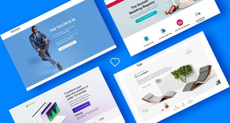
A picture is worth a thousand words”, as it helps communicate a message much better than written words do. Images are effective but they won’t do any good if they have not been created well and optimized further. When using the images, try to choose the ones having the high-resolution. Find out if they establish any connection with your website. At one hand, where images will add to the complete aesthetics of your website, they will also contribute to holding the visitors over the website and add to their overall user experience.
Make it a point to understand the reasoning behind the 5 elements discussed here. Put them into everyday web design practice. You’re guaranteed to come out ahead any time you’re given the opportunity to put a one-pager together.
Mixing all 5 can be tough at times. But you can take a shortcut! How? By using pre-built websites that already incorporate these elements
OpenAI DevDay showcases the latest AI innovations, pushing technology’s boundaries in an ever-evolving landscape.
Explore the top 10 database types for software projects, their unique features, and which one…
Explore PWAs: Your FAQs Guide to Integrating Camera, Geolocation & Device APIs. Harness native features…
General Understanding of PWAs and SEO 1. What is a Progressive Web App (PWA)? A…
Understanding Offline-First Approach Basics 1. What is the concept of "Offline-First" in the context of…
General Overview 1. What are cross-platform frameworks, and how do they relate to Progressive Web…


