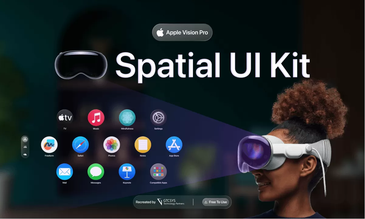
Designing a Spatial UI Kit for Apple Vision Pro: A Design System Guide

In today’s digital landscape, user interfaces (UI) have evolved beyond traditional two-dimensional screens. The rise of augmented reality (AR), virtual reality (VR), and mixed reality (MR) has opened up new possibilities for designing interfaces that interact with the physical space around us. These spatial user interfaces (UI) provide a unique and immersive experience, blurring the boundaries between the digital and physical worlds.
Design system for spatial user interfaces requires a thoughtful approach to ensure seamless interactions and intuitive experiences. In this comprehensive guide, we will explore the key principles, practices, and components involved in creating a design system specifically tailored for spatial UI.
Understanding Spatial UI Foundations
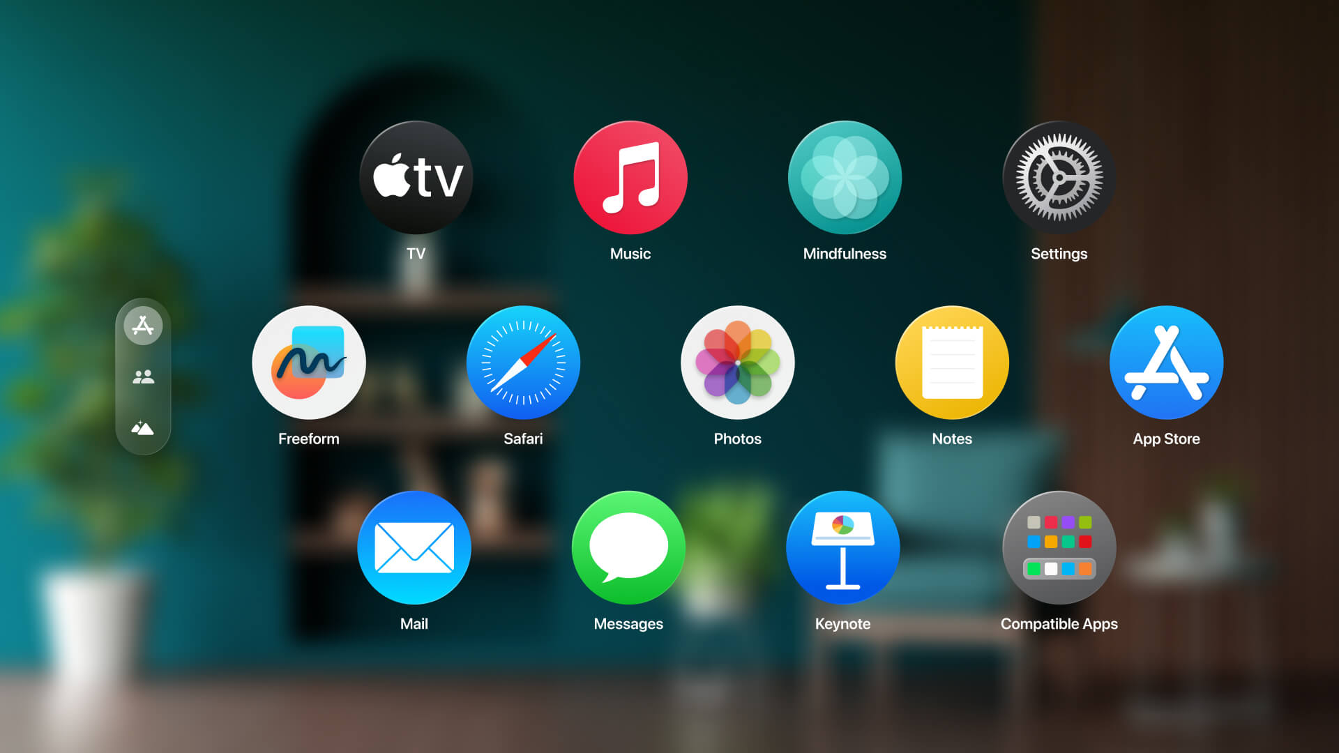
App Icons
App icons play a crucial role in spatial UI design, as they serve as entry points to digital experiences. When designing app icons for spatial UI, it’s essential to consider their three-dimensional nature. Here are some guidelines to keep in mind:
- Three-Dimensional and Realistic Icons: Design app icons with depth and realism, making them visually consistent with the overall spatial environment.
- Multiple Layers: Utilize multiple layers to add depth, specular highlights, and shadows to the icons, creating a more immersive visual experience.
- Recommended Image Sizes and Backgrounds: Ensure the app icons are optimized for various display sizes and resolutions. Transparent backgrounds can help icons seamlessly blend into different backgrounds.
Materials
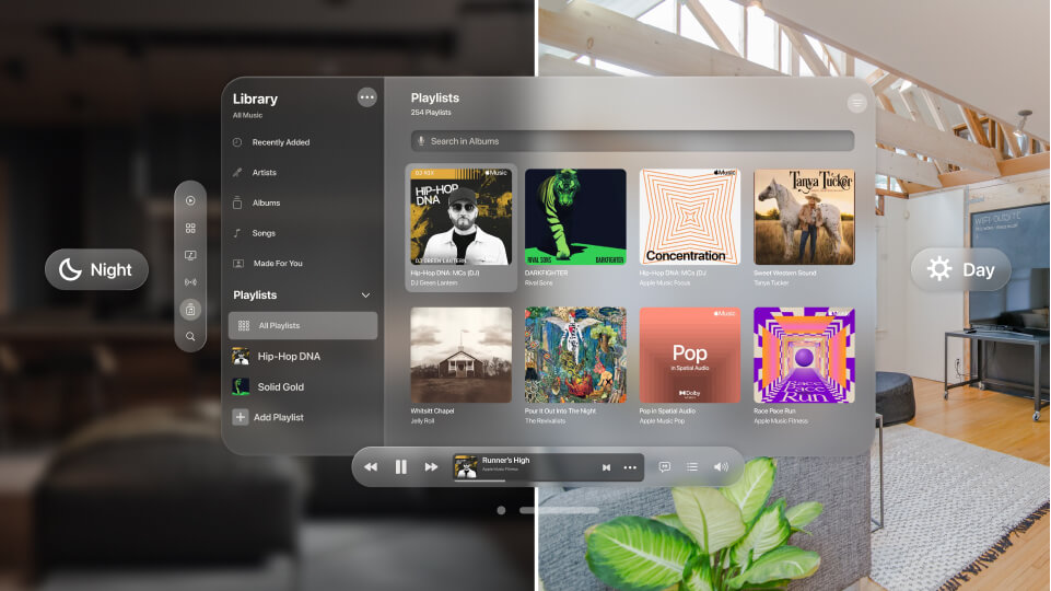
Materials play a significant role in spatial UI design, as they define the appearance and behavior of digital objects within the environment. Here are some considerations when designing with materials:
- Introduction to Glass Material: Glass is a popular material choice for spatial UI due to its transparency and adaptability. Understand its properties and how it interacts with lighting conditions and surroundings.
- Vibrant Materials for Legibility: Use vibrant materials that enhance legibility and contrast in different lighting conditions. Experiment with materials that can dynamically adapt to the environment.
- Best Practices: Follow best practices for designing with different materials to ensure consistency and visual coherence across the spatial UI.
Typography
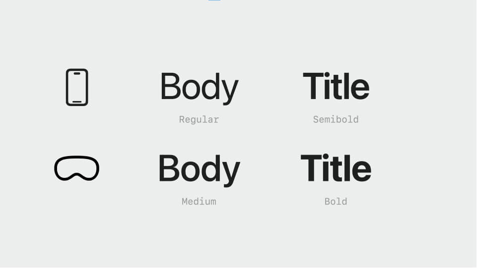
Typography plays a vital role in spatial UI design, contributing to the legibility and overall aesthetic of the interface. Here are some considerations for typography in spatial UI:
- Font Styles and Semantic Names: Understand different font styles and their semantic names. Consider how they can adapt to the spatial UI context.
- Legibility and Contrast Adaptations: Adapt typography to improve legibility and contrast in varying lighting conditions and backgrounds.
- Font Weights and Tracking: Explore different font weights and tracking options to ensure readability across different spatial UI scenarios.
- New Font Styles for Wide Layouts: Introduce new font styles suitable for wide, editorial-style layouts in spatial UI designs.
Vibrancy
Vibrancy is crucial in maintaining legibility and visibility in spatial UI. Here’s how you can incorporate vibrancy effectively:
- Importance of Vibrancy: Understand the significance of vibrancy in spatial UI design and its impact on user experience.
- System-Defined Vibrant Materials: Utilize system-defined vibrant materials that provide visual consistency and legibility.
- Using System Colors and White Text: Leverage system colors and white text to ensure optimal visibility in different lighting conditions.
- Dynamic Adaptability: Design materials that can dynamically adapt to different backgrounds and lighting conditions for enhanced legibility.
Creating Ergonomic Layouts
Content Placement
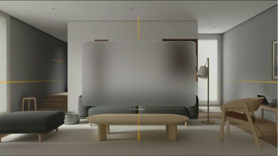
Ergonomic content placement is crucial for ensuring user comfort and optimal interaction within the spatial UI. Consider the following tips:
- Design for Physical Comfort: Prioritize user comfort by placing content within the user’s field of view and reachable zones.
- Centering Important Information: Center important information to ensure it is easily accessible and visible to the user.
- Preferred Aspect Ratios: Understand preferred aspect ratios for spatial UI designs and consider their impact on content placement.
Content Sizing
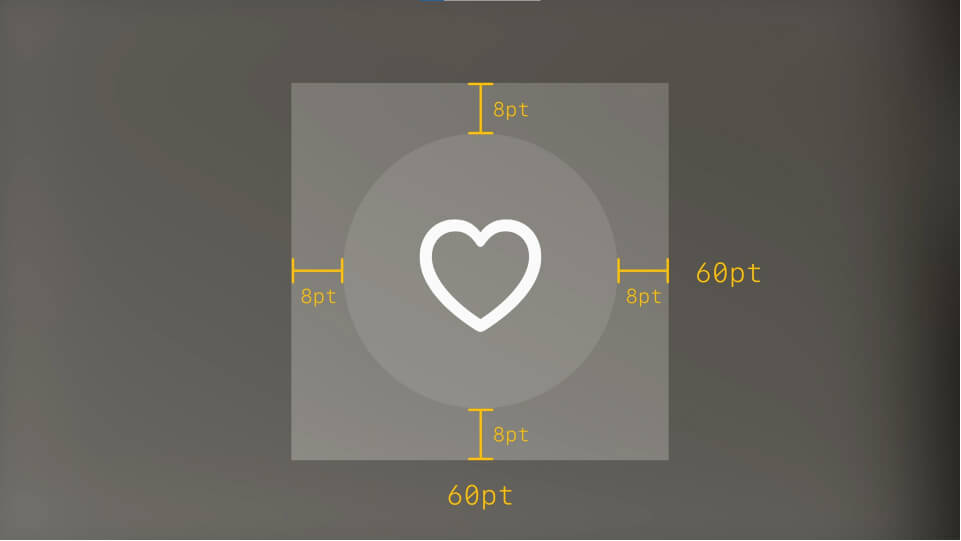
Easy target sizes for interactive elements are essential in spatial UI to facilitate smooth and accurate interactions. Consider the following guidelines:
- Tap Target Area and Minimum Spacing: Ensure interactive elements have sufficient target sizes and minimum spacing to accommodate user interactions.
- Visually Smaller Elements with Spacing: Explore techniques to visually shrink elements while maintaining sufficient spacing for easy interaction.
- Sizing for Large and Extra-Large Buttons: Adjust sizing considerations for large and extra-large buttons to optimize user interactions.
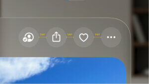
Focus Feedback

Focus feedback is crucial in spatial UI to provide users with visual cues and indications of interactive elements. Consider the following:
- Importance of Focus Feedback: Understand the significance of focus feedback in guiding users’ attention and interactions.
- Visual Brightening or Hover Effect: Implement visual brightening or hover effects to indicate interactive elements.
- Padding in List or Menu Layouts: Apply appropriate padding in list or menu layouts to ensure focus feedback is visually distinguishable.
- Custom Lock-ups for Focus Feedback: Create custom lock-ups that define regions for focus feedback, enhancing the overall user experience.
Exploring Core Components and Interactions
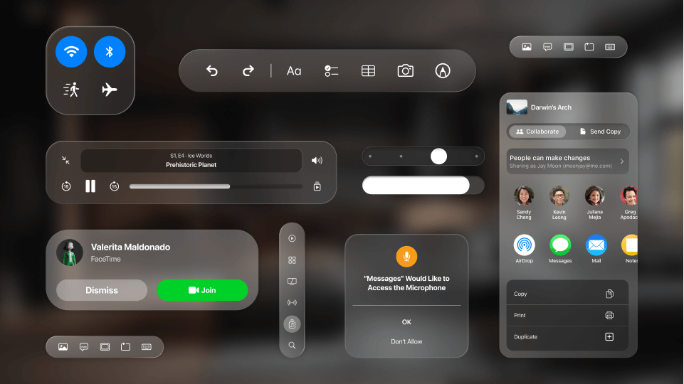
Inputs
Spatial UI integrates various input modalities, including eyes, hands, and voice. Ensure proper feedback for each input:
- Input Model Overview: Understand the input model of spatial UI, encompassing eye tracking, hand gestures, and voice commands.
- Providing Appropriate Feedback: Provide relevant and contextual feedback for each input modality, ensuring seamless interactions.
- Leveraging System Components: Utilize system components and interactions to streamline the interface creation process.

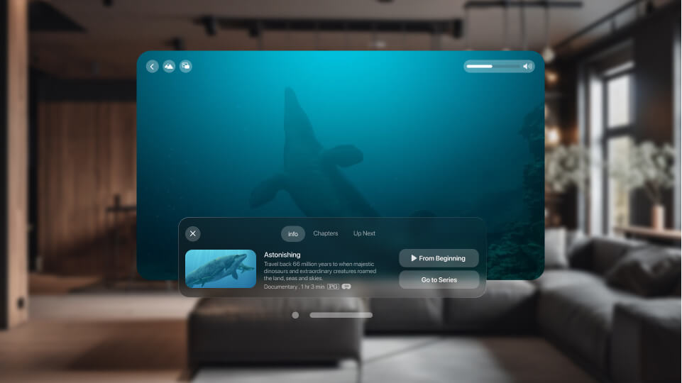
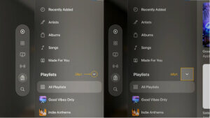
Window, Tab Bar, and Sidebar
The core structure of a spatial UI app includes windows, tab bars, and sidebars. Here’s an overview:
- App Structure: Understand the structure of an app in spatial UI, comprising windows, tab bars, and content.
- Window Bar and Glass Material: Describe the window bar and its association with the glass material, maintaining visual consistency.
- Tab Bar as Main Navigation: Utilize the tab bar as the primary navigation component, enabling quick access to different sections.
- Vertical Tab Bar for Sub-Navigation: Explore the vertical tab bar for sub-navigation purposes and understand its behavior.
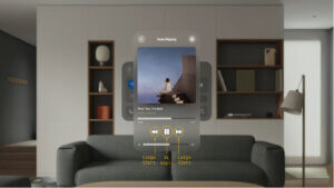
Presenting Content
Spatial UI provides unique opportunities for presenting content in immersive and engaging ways. Consider the following guidelines:
- New Presentation Paradigms: Introduce new ways of presenting content in spatial UI, leveraging the immersive capabilities of the environment.
- Flexible Layout Options: Explore different layout options that adapt to the user’s interactions and environment.
- Guidelines for Immersive Content Layouts: Provide guidelines for creating immersive and engaging content layouts in spatial UI designs.
Modalities
Modalities refer to different modes of interaction within spatial UI. Here’s how you can leverage them effectively:
- Understanding Modalities: Explain the concept of modalities and their applications in spatial UI, including gaze, gesture, and voice.
- Integration of Multiple Modalities: Integrate multiple modalities to create a rich and enhanced user experience.
- Examples of Modalities in Action: Showcase examples of modalities in action and their benefits in spatial UI designs.
Conclusion
Designing for spatial user interfaces requires a holistic approach that considers the unique challenges and opportunities of immersive and interactive environments. By following the principles and practices outlined in this comprehensive guide, designers can create intuitive, immersive, and engaging spatial UI experiences.
Recapping the key design principles and practices discussed, we emphasized the importance of considering spatial and immersive experiences in UI design. Furthermore, we encouraged designers to leverage the provided visual language and system components to streamline the development process and create remarkable spatial UI designs.
Remember, designing for spatial user interfaces is an exciting frontier that continues to evolve. By staying informed, embracing creativity, and pushing the boundaries of what’s possible, designers can shape the future of immersive digital experiences. So, let your imagination run wild and create spatial UI designs that captivate and delight users in the realms of augmented and virtual realities.
We recreated the UI Kit for Figma that you can download from the below link

Related Reading
- Apple Vision Pro: Blending the Digital and Physical Worlds with Spatial Computing
- Apple Vision Pro: Design Principles And Guidelines
- Enhancing Product Design and Visualization with Apple Vision Pro
Evaluating Apple Vision Pro for your business?
We help teams assess where spatial computing genuinely adds value — and build the experiences that do.
Strategy, prototyping, and visionOS development.
Talk spatial strategyA technical conversation, not a sales pitch.